Today we’ll be covering some basics on FlxSlider. Sliders are commonly used in options menu, e.g. music volume.
For the purpose of simplicity, let’s proceed with this goal — a slider that can adjust the x/y position of a player object.
Note: It seems the FlxSlider only has a horizontal bar, no vertical version.
Setup
Let’s create a new HaxeFlixel project, as usual:
|
1 |
flixel tpl -n "MySliderTest" |
Creating The Player
Let’s create a player object in the default starting class for HaxeFlixel projects — the MenuState.hx:
|
1 2 3 4 5 6 7 8 9 10 11 12 13 14 15 16 17 18 19 20 21 22 23 24 25 26 27 28 |
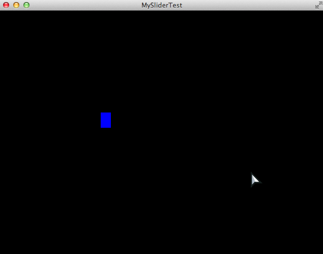
package; import flixel.FlxState; import flixel.FlxG; import flixel.FlxSprite; class MenuState extends FlxState { override public function create():Void { super.create(); // Create a blue square as the player var myPlayer = new FlxSprite(200, 200); myPlayer.makeGraphic(20, 30, 0xFF0000FF); add(myPlayer); } override public function update():Void { super.update(); } override public function destroy():Void { super.destroy(); } } |
You should see this when you build with lime test neko :
Creating The Slider
The slider is not part of the basic flixel package — we need to use the flixel-addons haxelib. Go to the Project.xml file and uncomment the line as shown below:
|
1 2 |
<!--In case you want to use the addons package--> <haxelib name="flixel-addons" /> |
Now that the haxelib is included, you can use FlxSlider. In the MenuState.hx, let’s add the following code:
|
1 2 3 4 5 6 7 8 9 10 11 12 13 14 15 16 17 18 19 20 21 22 23 24 25 26 27 |
package; import flixel.FlxState; import flixel.FlxG; import flixel.FlxSprite; import flixel.addons.ui.FlxSlider; class MenuState extends FlxState { override public function create():Void { super.create(); // Create a blue square as the player ... // Create a slider and track the "x" property var mySliderH = new FlxSlider(myPlayer,"x",10,10,200,500,300,40,15,0xFFFF0000,0xFF00FF00); add(mySliderH); // Create a slider and track the "y" property var mySliderV = new FlxSlider(myPlayer,"y",10,100,200,400,300,40,15,0xFFFF0000,0xFF00FF00); add(mySliderV); } ... } |
And here’s the output:
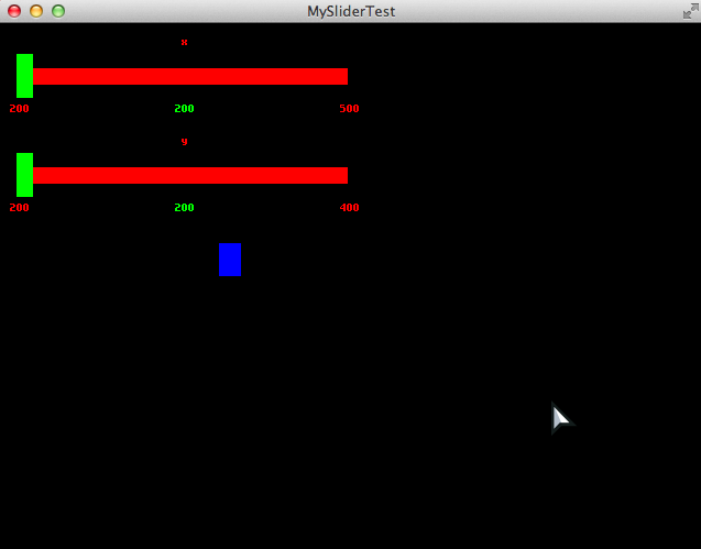
It’s a little ugly, but it works out of the box. We’ll polish the aesthetics later.
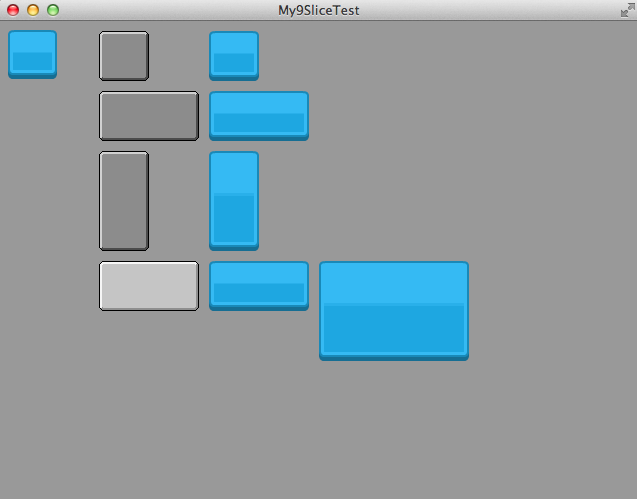
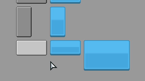
Referring to the new() function in the API page, here’s an illustration for quick reference:
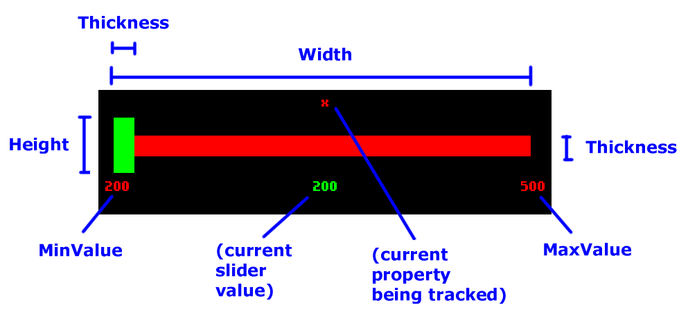
Note — the Thickness parameter affects both the handle AND the bar’s thickness.
Improving The Slider
Now, how do we improve the slider? Let’s list down a few things we may want to do:
- Have an image for the handle
- Have an image for the bar
- Replace the labels with custom font and text
- Play sound on event (hover, click)
- Trigger a callback on value change, for whatever reason
That’s a handful of things, so let’s tackle them one by one.
Setup (again)
Before we proceed, let’s download some placeholder resources. Let’s use Kenney’s UI Pack — it contains some sounds, fonts and graphics in one package.
For graphics, put these in the /assets/images folder: blue_sliderDown.png and blue_panel.png.
For the audio, put these in the /assets/sounds folder: rollover1.ogg and switch3.ogg.
For the font, put this in the /assets/data folder: kenvector_future.ttf.
Code Cleanup
Let’s clean up the code a little — adhering to the DRY principle:
|
1 2 3 4 5 6 7 8 9 10 11 12 13 14 15 16 17 18 19 20 21 22 23 24 25 26 27 28 29 30 |
override public function create():Void { super.create(); // Make background lighter for visibility sake FlxG.camera.bgColor = 0xFF555555; // Create a blue square as the player var myPlayer = new FlxSprite(200, 200); myPlayer.makeGraphic(20, 30, 0xFF0000FF); add(myPlayer); // Declare variables for visibility sake var sX = 10; // slider X var sY = 10; // slider Y var sMin = 200; // slider MinValue var sMax = 500; // slider MaxValue var sW = 400; // slider width var sH = 40; // handle/slider height var sT = 20; // handle/slider thickness // Create the sliders. We don't provide color parameters // because we're using custom images already. var mySliderH = new FlxSlider(myPlayer,"x",sX,sY,sMin,sMax,sW,sH,sT); var mySliderV = new FlxSlider(myPlayer,"y",sX,sY+80,sMin,sMax,sW,sH,sT); // Add the sliders to the game add(mySliderH); add(mySliderV); } |
And here’s the updated output:

Updating The Slider Body
The body property is a FlxSprite. That means we can modify the image by using loadGraphic , or create a complicated Sprite image and load it into the body. In our case, the default FlxSprite does not have 9-slice capabilities. But wait! We can create a 9-slice image, then load that image into the slider’s body. Awesome hack, huh? Let’s try that now:
|
1 2 3 4 5 6 7 8 9 10 11 12 13 14 15 16 17 18 19 20 21 22 23 24 25 26 27 28 29 30 31 32 33 34 35 36 37 38 39 40 41 42 43 44 45 |
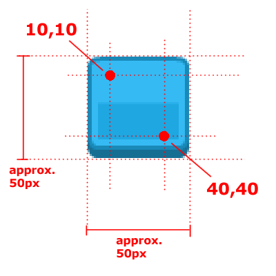
package; import flixel.FlxState; import flixel.FlxG; import flixel.FlxSprite; import flixel.addons.ui.FlxSlider; import flixel.addons.ui.FlxUI9SliceSprite; class MenuState extends FlxState { override public function create():Void { super.create(); // Make background lighter for visibility sake ... // Create a blue square as the player ... // Declare variables for visibility sake ... // Create the sliders. We don't provide color parameters // because we're using custom images already. ... // Declare variables for the sliced image. // Note the sliced image's width/height matches the slider. var bodyImage = "assets/images/blue_panel.png"; var bodyRect = new flash.geom.Rectangle(0,0,sW,sT); var bodySlice = [10,10,90,90]; // Refer to the blue_panel.png for the x1,y1,x2,y2 slice points var bodySprite = new FlxUI9SliceSprite(0,0,bodyImage,bodyRect,bodySlice); // create the 9-slice image // Copy the resulted 9-slice image into the slider's body image // and center the body between the handle mySliderH.body.loadGraphicFromSprite(bodySprite); mySliderH.body.y += (mySliderH.handle.height/2) - (mySliderH.body.height/2); // Add the sliders to the game ... } ... } |
And here’s the output:

Updating The Slider Handle
We can do the same thing (loading a 9-sliced image) for the handle, but it’s unnecessary in this case. So let’s do it in a simpler way, and update the code as follows:
|
1 2 3 4 5 6 7 8 9 10 11 12 13 14 15 16 17 18 19 20 21 22 23 24 25 26 27 28 29 30 31 32 33 34 35 |
override public function create():Void { super.create(); // Make background lighter for visibility sake ... // Create a blue square as the player ... // Declare variables for visibility sake ... // Create the sliders. We don't provide color parameters // because we're using custom images already. ... // Declare variables for the sliced image. // Note the sliced image's width/height matches the slider. ... // Copy the resulted 9-slice image into the slider's body image // and center the body between the handle ... // Load the handle image as a non-sliced sprite var handleImage = "assets/images/blue_sliderDown.png"; mySliderH.handle.loadGraphic(handleImage); // Reposition the handle to center of bar mySliderH.handle.y = mySliderH.body.y - (mySliderH.handle.height/2) + (mySliderH.body.height/2); // Add the sliders to the game ... } |
And this is how it looks:

Updating The Text
We can easily format the slider’s text like this:
|
1 2 3 4 5 6 7 8 9 10 11 12 13 14 15 16 17 18 19 20 21 22 23 24 25 26 27 28 29 30 31 32 33 34 35 36 37 38 39 40 41 42 43 44 |
override public function create():Void { super.create(); // Make background lighter for visibility sake ... // Create a blue square as the player ... // Declare variables for visibility sake ... // Create the sliders. We don't provide color parameters // because we're using custom images already. ... // Declare variables for the sliced image. // Note the sliced image's width/height matches the slider. ... // Copy the resulted 9-slice image into the slider's body image // and center the body between the handle ... // Load the handle image as a non-sliced sprite ... // Reposition the handle to center of bar ... // Update the texts var fontPath = "assets/data/kenvector_future.ttf"; var fontSize = 12; var fontColor = 0xFFFFFFFF; mySliderH.minLabel.setFormat(fontPath, fontSize, fontColor, "right"); mySliderH.maxLabel.setFormat(fontPath, fontSize, fontColor, "left"); mySliderH.nameLabel.setFormat(fontPath, fontSize, fontColor, "center"); mySliderH.valueLabel.setFormat(fontPath, fontSize, fontColor, "center"); mySliderH.nameLabel.text = "The awesome X position"; // Add the sliders to the game ... } |
Now, the slider looks a lot better already, with the updated text and font:

Adding Sound
There are only two events which you can attach a sound to — the hover and click events. So, since it’s there, we might as well make the best of it:
|
1 2 3 4 5 6 7 8 9 10 11 12 13 14 15 16 17 18 19 20 21 22 23 24 25 26 27 28 29 30 31 32 33 34 35 36 37 38 39 40 41 |
override public function create():Void { super.create(); // Make background lighter for visibility sake ... // Create a blue square as the player ... // Declare variables for visibility sake ... // Create the sliders. We don't provide color parameters // because we're using custom images already. ... // Declare variables for the sliced image. // Note the sliced image's width/height matches the slider. ... // Copy the resulted 9-slice image into the slider's body image // and center the body between the handle ... // Load the handle image as a non-sliced sprite ... // Reposition the handle to center of bar ... // Update the texts ... // Add sound events - on hover, and on click mySliderH.hoverSound = "assets/sounds/rollover1.ogg"; mySliderH.clickSound = "assets/sounds/switch3.ogg"; // Add the sliders to the game ... } |
I can’t demonstrate the sound through image or GIF, but you should be able to hear the sound when you test the game.
Event Callback
Finally, we most probably need to do something when a value changes on the slider. Perhaps, for example, when the player’s x-position is updated, we play the player’s “victory” animation. To add an event, just add a function to the callback property, like this:
|
1 2 3 4 5 6 7 8 9 10 11 12 13 14 15 16 17 18 19 20 21 22 23 24 25 26 27 28 29 30 31 32 33 34 35 36 37 38 39 40 41 42 43 44 45 46 47 48 49 50 51 52 53 54 55 56 57 58 59 60 61 62 63 64 65 66 67 68 69 70 71 72 73 74 |
package; import flixel.FlxState; import flixel.FlxG; import flixel.FlxSprite; import flixel.addons.ui.FlxSlider; import flixel.addons.ui.FlxUI9SliceSprite; class MenuState extends FlxState { var _sliderH:FlxSlider; override public function create():Void { super.create(); // Make background lighter for visibility sake ... // Create a blue square as the player ... // Declare variables for visibility sake ... // Create the sliders. We don't provide color parameters // because we're using custom images already. ... // Declare variables for the sliced image. // Note the sliced image's width/height matches the slider. ... // Copy the resulted 9-slice image into the slider's body image // and center the body between the handle ... // Load the handle image as a non-sliced sprite ... // Reposition the handle to center of bar ... // Update the texts ... // Add sound events - on hover, and on click ... // Add callback event _sliderH = mySliderH; mySliderH.callback = onValueChange; // Add the sliders to the game ... } function onValueChange (newValue:Float) { // Since "newValue" may not be sufficient sometimes, we can // make a class-scope reference using _sliderH, and modify // its properties instead. // NOTE: this value is actually outdated. trace("old value : " + _sliderH.valueLabel.text); // NOTE: the "newValue" is actually percentage value (0 to 1), // so, use the "value" property instead. trace("new value (percentage): " + newValue); trace("new value : " + _sliderH.value); } ... } |
And this concludes the slider tutorial.
In case you wonder why I am doing a lengthy tutorial on HaxeFlixel slider — it’s because the FlxSlider is the very first thing I attempted to learn in HaxeFlixel, and considering my lack of Haxe/HaxeFlixel knowledge back then, I couldn’t even figure it out. Now that I am more familiar with it, I figure I’d write a tutorial on it to test my understanding. I guess I’ve learned a lot! 🙂


