To handle 9-slice images and buttons, we will have to look into the flixel.addons.ui package, where we find FlxUI9SliceSprite (API). Thankfully, there is the flixel-ui Github page which includes a very lengthy readme of how to use the UI addons:
https://github.com/HaxeFlixel/flixel-ui
Unfortunately, it still takes some effort for beginners like myself to figure out how to use it, because the information focuses on using XML to generate and format the UI components. As such, we’re going to proceed with the tutorial below using only code, to illustrate usage without XML.
Setup
Let’s create a new template HaxeFlixel project for this tutorial:
|
1 |
flixel tpl -n "My9SliceTest" |
Now let’s find some placeholder images. We’ll be using this image, taken from Kenney’s UI pack (visit the website www.kenney.ul for more awesome stuff, btw!) — “blue_button07.png“:
![]() Right-click the image above, and save it into your HaxeFlixel project’s
/assets/images folder. Now we can begin coding.
Right-click the image above, and save it into your HaxeFlixel project’s
/assets/images folder. Now we can begin coding.
9-slice Images
In case you’re not sure how 9-slice works, here’s an image to demonstrate:
 In a nutshell, 9-slice images preserve the resolution of the borders. It’s most commonly used in dialogue boxes and button images.
Before we can use the flixel.addons.ui.FlxUI9SliceSprite class, we will need to include the haxelib. Go to your Project.xml and enable the following code:
|
1 2 |
<!--In case you want to use the ui package--> <haxelib name="flixel-ui"/> |
Now you can start using it. Here’s how we add a simple 9-slice image:
|
1 2 3 4 5 6 7 8 9 10 11 12 13 14 15 16 17 18 19 20 21 22 23 24 25 26 27 28 29 30 31 32 33 34 35 36 37 38 39 40 41 42 43 44 45 46 47 48 49 50 51 52 53 |
package; import flixel.FlxState; import flixel.FlxG; import flixel.FlxSprite; import flixel.addons.ui.FlxUI9SliceSprite; import flash.geom.Rectangle; class MenuState extends FlxState { override public function create():Void { super.create(); // Make the screen background lighter for visibility sake FlxG.camera.bgColor = 0xFF999999; // This is a normal image, which cannot be resized var myImage = new FlxSprite(10, 10); myImage.loadGraphic("assets/images/blue_button07.png"); add(myImage); // This is a basic 9-slice image with default skin var myDefaultImage1 = new FlxUI9SliceSprite(100, 10, null, new Rectangle(0,0,50,50)); var myDefaultImage2 = new FlxUI9SliceSprite(100, 70, null, new Rectangle(0,0,100,50)); var myDefaultImage3 = new FlxUI9SliceSprite(100, 130, null, new Rectangle(0,0,50,100)); add(myDefaultImage1); add(myDefaultImage2); add(myDefaultImage3); // This is a 9-slice image with the image loaded and sliced var _graphic:String = "assets/images/blue_button07.png"; // This is the [x1,y1,x2,y2] slice points in the image. // x1,y1 is the top-left, x2,y2 is the bottom-right. var _slice:Array<Int> = [10,10,40,40]; var myCustomImage1 = new FlxUI9SliceSprite(210, 10, _graphic, new Rectangle(0,0,50,50), _slice); var myCustomImage2 = new FlxUI9SliceSprite(210, 70, _graphic, new Rectangle(0,0,100,50), _slice); var myCustomImage3 = new FlxUI9SliceSprite(210, 130, _graphic, new Rectangle(0,0,50,100), _slice); add(myCustomImage1); add(myCustomImage2); add(myCustomImage3); } override public function update():Void { super.update(); } override public function destroy():Void { super.destroy(); } } |
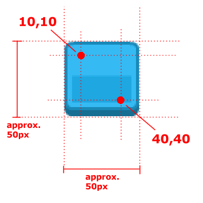
In case you’re wondering how the _slice works, here’s an illustration:
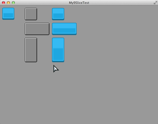
This should be the result when you build with lime test neko :
9-slice Buttons
If you look at the FlxUITypedButton API page, the descriptions are not helpful in telling you how to use the 9-slicing. However, if you look into the code (FlxUITypedButton.hx on Github), you will discover that there are in fact, annotated comments for the function.
Before we proceed, let’s add the following images into the /assets/images folder:
Now let’s update the code like this:
|
1 2 3 4 5 6 7 8 9 10 11 12 13 14 15 16 17 18 19 20 21 22 23 24 25 26 27 28 29 30 31 32 33 34 35 36 37 38 39 40 41 42 43 44 45 46 47 48 49 50 51 52 53 54 55 56 |
package; import flixel.FlxState; import flixel.FlxG; import flixel.FlxSprite; import flixel.addons.ui.FlxUI9SliceSprite; import flixel.addons.ui.FlxUITypedButton; import flash.geom.Rectangle; class MenuState extends FlxState { override public function create():Void { super.create(); // Make the screen background lighter for visibility sake ... // This is a normal image, which cannot be resized ... // This is a basic 9-slice image with default skin ... // This is a 9-slice image with the image loaded and sliced ... // This is a 9-slice button with default skin var myButton = new FlxUITypedButton(100, 240); myButton.resize(100,50); add(myButton); // This is a 9-slice button with 3 different images for the 3 states var myButton9Slice = new FlxUITypedButton(210, 240); var _graphic_up:String = "assets/images/blue_button07.png"; var _graphic_hover:String = "assets/images/green_button07.png"; var _graphic_down:String = "assets/images/blue_button08.png"; var _graphicArray:Array<String> = [_graphic_up, _graphic_hover, _graphic_down]; var _sliceArray:Array<Array<Int>> = [_slice, _slice, _slice]; // all 3 buttons have same slicing myButton9Slice.loadGraphicSlice9(_graphicArray, 100, 50, _sliceArray); add(myButton9Slice); // This is a 9-slice button with 3 images in one spritesheet for the 3 states // Note: images are processed VERTICALLY // Note: image sheet's height must be at least 3 button's height // (for each state; up, hover, down), otherwise the game will crash. // E.g. if the original button size is 50x50, then the spritesheet // size must be AT LEAST 50x150. var myButton9Slice2 = new FlxUITypedButton(320, 240); var _graphic_sheet:String = "assets/images/sheet_button.png"; myButton9Slice2.loadGraphicSlice9([_graphic_sheet], 150, 100, _sliceArray, FlxUI9SliceSprite.TILE_NONE, -1, false, 49, 49); add(myButton9Slice2); } ... } |
The code above demonstrates 3 parts:
- Default 9-sliced button (with default skin)
- 9-sliced button using 3 separate images as the 3 states (up, hover, down)
- 9-sliced button using one image spritesheet
It may take a while to understand what the function parameters mean — in fact, I recommend you check the Github FlxUITypedButton.hx page, and look for the loadGraphicSlice9 function’s comments and read the parameter descriptions.
However, if you want a rundown of what to take note of, here’s some points:
- When loading separate 3 separate images for the button, make sure _graphicArray and _sliceArray are of equal length. For buttons, the length must be 3, and for toggle buttons, the length is 6. (We’ll talk about toggle buttons some other day!)
- When loading one spritesheet for the button, make sure to specify the original image size. In the code above, it’s the last two values 49, 49 part in Line 51.
- When loading one spritesheet for the button, you can either specify just one slice array data, or 3 slice array data. I.e. Line 51, the _sliceArray value can also be written as [_slice] or [_slice,_slice,_slice] .
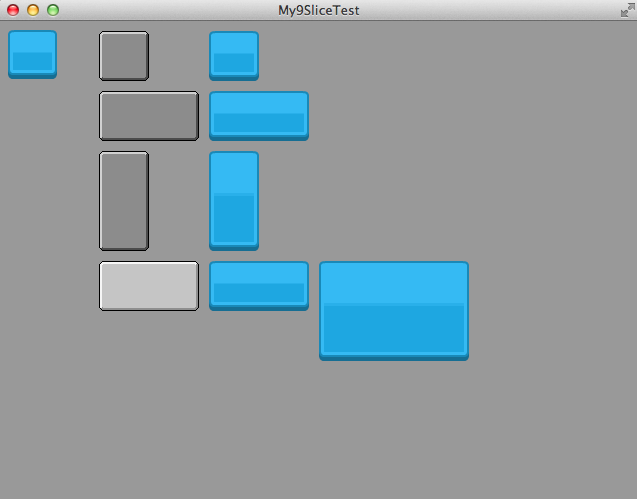
Here is a screenshot of how the screen should look like in the end, after adding the three 9-slice button code above:
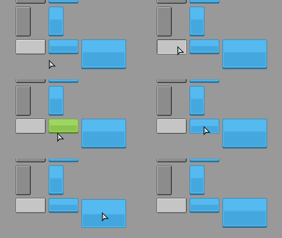
And this is a GIF of the buttons in action, to further illustrate the button’s states (up, hover, down):
This concludes the tutorial for 9-slice images and buttons. I hope it wasn’t too confusing — It took me a while to figure it out, and it took me even longer to find a way to write the tutorial in an understandable way.
In the next post, we move on to another most commonly used component — Text in HaxeFlixel.


